Glam Guide Website
Client
Glam Guide
Sector
Education, Social Media
My Role
UX Designer
Project Time
3 months
Project Overview
The Product
Glam Guide is an online makeup tutorial sharing platform which aims to inspire and teach makeup skills to millions of viewers, allowing users to save tutorials in personalized folders. Glam Guide focuses on providing a seamless learning experience and convenient content access. Our target users are makeup enthusiasts and beginners seeking to enhance their skills and explore new makeup content.
The Problem
Busy makeup users have trouble discovering new makeup skills and saving content in an organized manner.
The Goal
Create a website dedicated to makeup tutorial content that allows users to watch and save tutorials to personalized folders for easy access.
Understanding the User
User Research Summary
I conducted interviews and created user stories to gain insights into the users I’m designing for and their needs. I also led a competitive audit of indirect and direct competitors to discover gaps in the market and learn more about our A primary user group identified through research was the “novice” makeup user who wants to learn more makeup skills but is intimidated by the task of discovering and saving tutorials across all video sharing apps.
This user group confirmed initial assumptions about Glam Guide customers, but research also revealed that the disjointed nature of saving videos across multiple apps was not the only limiting factor preventing folks from watching tutorials. Other problems include the lack of written directions and easy access to the products featured in the videos.
User Pain Points
Disjointed Nature
Busy folks don’t have time or resources to search across multiple apps and save videos in an organized fashion
Lack of Written Instructions
Users have trouble following makeup tutorial instructions as they are typically spoken by the creator and could easily be missed, especially by those with hearing disabilities
Access to Products
The products used in makeup tutorials are rarely linked in the video, forcing the user to search for the products themselves
Persona
Competitive Audit
User Journey Map
Mapping Kristen’s user journey revealed that users could benefit from the ability to save videos in dedicated folders, improving their skills and simplifying their makeup experience.
Starting the Design
Paper Wireframes
I created multiple paper wireframes to ideate on potential solutions to user issues, before moving on to digital wireframing. On the home screen, I opted for big video tiles, a straightforward navigation bar, and clear "search by folder" buttons, so that users could peruse through their personalized feeds with ease.
Digital Wireframes
As the initial design phase continued, I made sure to ground the screen designs in valuable feedback and findings from user research which ensured that the designs were empathetic and addressed user problems
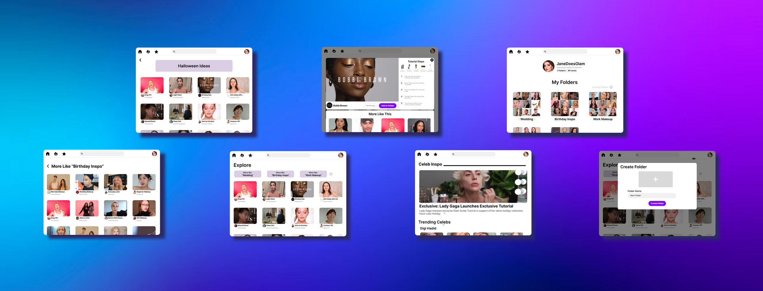
The large video cards give the user a simple preview of available content
The folder buttons provide users with a quick and easy way to select and explore their personalized folders, based on previously saved videos
An efficient and intuitive saving flow was key to address in the designs, as well as the need for a simplified instruction section, featuring links to products and clear directions
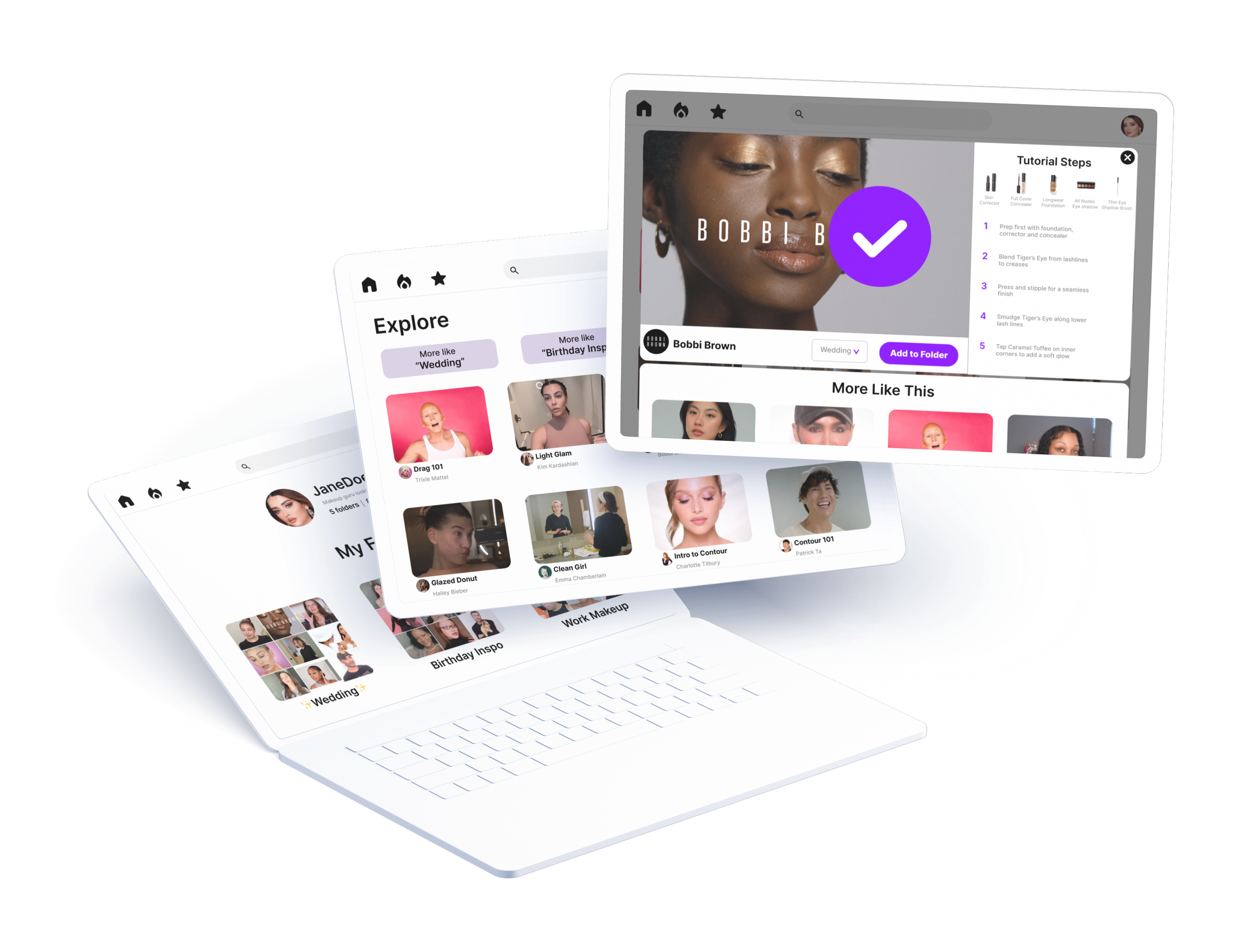
The tutorial instructions are clearly listed next to the video, for a seamless follow along experience. This section also includes like to the products so users can easily purchase the necessary products
The folder selection drop down menu allows users to easily save videos to any of their folders, with the save CTA button located adjacent for easy access
Low Fidelity Prototype
The low-fidelity prototype connected the primary user flow, which included finding and saving makeup tutorial videos to folders, so that the prototype could be tested by participants in a usability study
View the Glam Guide low-fidelity prototype
Usability Study Findings
I conducted an unmoderated usability study with four participants on the lo fi prototype. Findings from this study informed the iteration from wireframes to mockups. The second study, using a high-fidelity prototype, also include four study participants and revealed which aspects of the mockups needed refining.
Save button was confusing and hard to find
Users wanted to stay on the video watching page even after saving the video
The “added to folder” red notification symbol mislead users to thinking that there was another step to the process
Users wanted the landing page to show a preview of the explore feed before you logged in
Study Findings
Refining the Design
Mockups
Early designs of the video viewing page included a small call to action button and a large profile info section. After reviewing the feedback from my usability study, I prioritized the space for the video and tutorial steps, opting to place the profile info and CTA buttons below the video to improve the viewing experience. Research study participants mentioned that they were confused by CTA button’s function, so I added copy to the CTA button. I iterated on the original design to prevent the video from closing after adding to the folder, as study participants suggested they’d want to video to continue playing.
Before
After
The usability study also revealed participant confusion with the red notification bubble appearing above the folder to which they saved a video. To alleviate confusion, I removed the red bubble and opted instead to just include a large check animation when users successfully add a video to a folder to alert users that their video has been successfully added. I also renamed the folders page to “My Folders” as some participants were confused by the original title.
Before
After
Preview
High Fidelity Prototype
The final high fidelity prototype presented simpler, more intuitive user flows for discovering and saving makeup tutorials. It also met user needs for seamless organization, easy to follow instructions, and the ability to easily find and purchase the products used in each tutorial.
View the Glam Guide high-fidelity prototype
Moving Forward
Takeaways
Impact
The most recent iteration addressed all participant concerns while staying true to the original mission of the project.
“I love this. I feel like I could totally see myself using this in real life.”
What I learned
While designing the this website, I learned the importance of usability studies and the fresh, new perspectives they offer. This particular study allowed me to look at the product in a new way, address issues that had been previously overlooked, and improve the design to best fit the user’s needs.
I also learned to always focus on the user’s needs. For example, I initially designed the video viewing page with aesthetic design in mind, but after completing user testing I discovered that it would be best to simplify the design to better address their needs.
Next Steps
1.
Conduct another round of usability studies to validate whether the pain points users experienced have been effectively addressed
2.
Conduct more user research to determine any new areas or features that need to be addressed
Let’s Connect
Thank you for taking your time reviewing my work on the Glam Guides website! If you would like to see more or get in touch, my contact information is provided below.


